Another "offtopic" post. I'm writing this really as a reminder for my spouse, as she wants to learn Photoshop a bit better, but I think it could be useful as many renderers do seem to dabble with photography (and it's surely a good thing to do so).
Now, two disclaimers
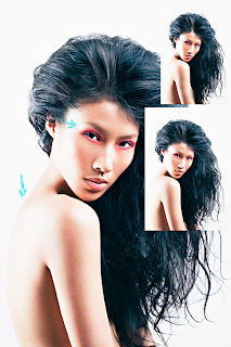
- This photo was taken for fun after a fashion show, it wasn't a photoshoot nor anything that was intended to be published. I've chosen this one to serve as an example of retouching, it's not the best one I've ever done and more importantly, it's not the most pleasing shot of the model as well. Also, the retouching work is partial at best, much more time could have been spent with it, I stopped when I reached a point that illustrates well enough what I do, not a "final" point for the photo itself.
- I'm not a professional retoucher and I certainly didn't spend much time researching this, so I'm not as confident about my practice as I am when I talk about rendering. Most of this is purely out of experience and does not even derive from reading books and tutorials from experienced photographers, which is strange when I think about it, as I tend to be uncomfortable if I don't know "everything" before starting doing a given thing. I was very surprised to see that this routine I "evolved" is not too far of from what pro retoucher Pratik Naik sketches here, even if my results are not in the same league, the theory should not be too far off :)
Prerequisites
- Photoshop of course. Unfortunately you'll need CS, even if day to day you'll probably use 5% of CS capabilities, the ones that are really useful are not the same that you'll find in Elements, which is aimed at people who don't want to spend a lot of time with their photos. I also use Lightroom, now all the raw global adjustments that you can do in Lightroom are the same as the ones you get from the Camera Raw when you open a photo in Photoshop. The benefit of Lightroom is not in the adjustments, but in the workflow. With digital cameras, shooting hundreds of photos at each shoot, the basic adjustments and selection of good candidates is really time consuming. That's also why I have Photosmith on the iPad which can import Lightroom collections.
- I tend to work in layers and all the work is non-destructive (because of my computer science background I guess, I still have a way of thinking about technical things which do not really matter I guess), this creates quite big photoshop files (I also always use 16bpp ProPhotoRGB colour space) so you'll need a computer with lots of RAM, mine is a iMac 27' that I bought for "cheap" refurbished with 4gb of ram and then immediately upgraded to 16.
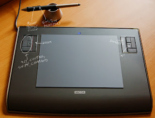
- A tablet is a must. It took me a while to get used to one, I started years ago (my first tablet connected over a serial cable... my first Photoshop was 2.5) and cheap tablets might dissuade you (i.e. I find too soft nibs to be really frustrating) but trust me, get a Wacom and live happily. You don't have to spend lots of money, I have an old Intuos 3 A5 and an even older Graphire 3 A5.
- A calibrated monitor. I don't use the shiny iMac monitor as shiny monitors are useless :| so I have next to it another 27', from the "high-end" Dell series. It's very decent and great quality for the money.
Tablet setup
The fundamental keys I always use are the modifiers (shift, control, command, alt) which access different options for any given tool. The right mouse button is mapped as the main button on the pen, that accesses the brush options while drawing and you'll change these every second. The other frequently accessed key is the 'x' button. This switches between background and foreground color when painting. While retouching we will always painting layer masks, so having these colors set to black and white and alternating between them with the x key makes this task very effective.
As I have two monitors and as you have to map only one to your tablet (be sure to avoid any stretching in the mapping setup), I reserve the second button to the "switch monitor" operation for the tablet. That's because I keep all the photoshop dialogs on the second monitor, so this button helps to avoid having to reach for the mouse every time I want to go on the second monitor (which I still do time to time).
Photoshop setup and learning prerequisites
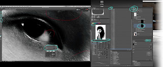
As I have lots of space, especially on the iMac monitor which is higher resolution than my second "main" one I tend to have all the windows open. If you have less space, what you want to have always visible are the layers, the history and maybe the navigator, other than the main tool bar.
The things you absolutely need to know for this kind of retouch work are the following, you can use the Photoshop manual, experiement a bit or go on youtube and follow some basic tutorials for these but they are fundamental.
- Layers: layer masks and adjustment layers. Blending options are useful to know too.
- Adjustment curves at least. Levels are important too but out of lightroom I already export an image with the right levels and white balance. All the other image adjustments are also important but curves are the king.
- Selection tools: at least the rectangle and the polygon lasso. I don't need too precise selections because I copy and paste rough patches and then precisely mask them out using layer masks.
- Image and selection transforms (edit - free transform)
- How to copy and paste from a layer and how to copy and paste from all layers (copy merged)
- Drawing tools: the brush and its options (especially opacity and how it can be controlled with the numeric row of keys), clone tool (how to use, and the sample - current and below option), the healing brush (how it works and the sample all layers option, note that you don't get "current and below" option here, for some reason)
- Brush options (right mouse button)
- Zoom tool, navigator and shortcuts for image zoom and move.
- The liquify image filter.
I don't customize Photoshop much, which probably I should. I don't even use all the shortcuts I could, this is similar to what I do when programming, I don't focus too much on the speed of doing the actions, I will (probably) never learn VI. What does that mean is that you don't need to do much to replicate my setup :)
The most important thing is how I set the tablet to work with the various tools, and what I do is extremely simple: I let the tablet pressure drive the paint opacity only. You do this by going in the brush window and selecting "transfer" and under "opacity jitter" select "control: pen pressure". You also might want to disable any other pen controls you might have in the brush (i.e. no "shape dynamics") and save this as a custom brush preset (the brush options are different for each tool so you might need to do this a few times or select the same preset for all the drawing tools you use).
The reason for this is simple, I want to always precisely control the size of the painting area, so I enter that using the brush options on the right mouse button (size and hardness), while for the intensity of the paint the tablet works great, together with the master opacity setting you can change via the keyboard numeric row (which sets the maximum opacity you will get at full pressure)
First step: General image composition
As a general rule, I will layer the various corrections from the most fundamental up to the most "artistic", this is so you build your work upon a reasonable base image. The corrections at the bottom of the stack, done first, are the ones that won't change regardless of the final image style, the ones at the top are the most "flexible" and due to changes.
This rule, I immediately break it with the very first layer, the background image. Now, if you're working for a client, you might not want to do this, but as I work for myself and I find reasonable to have all the general qualities roughly in place before retouching, as this will provide a better reference of what to retouch and what is most important.
That's why my base image out of Lightroom is already "close to final" interpretation, what I do is often adjust it to what I like in Lr and select the shot using "final" settings and crops, then back out a bit if they are too extreme (burn blacks or whites too much, or have weird coloring and so on) so I have a more flexible image in photoshop (one that still has all the detail and tones so I can push them locally later in Photoshop in a more controlled way). You could start with a very neutral image instead and decide your final art direction last, after all the skin work, and probably it is a good idea. I don't do that.
Similarly, I do first all the major liquify changes and if I'm compositing multiple images, replacing the face or the hair from one into another and so on, I do it here. You might want to liquify last if you're working for a client as they tend to change idea often, or just do a base liquify here and more extreme "artistic" changes later. Liquify is always a destructive operation so if you do it last, copy merged and paste the entire picture in another top level layer and liquify that copy, if you need to change you can delete said layer and do it again.
Second step: Major skin defects
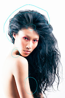 |
| After this step |
Now here is where I "cheat" a bit by taking some shortcuts. Retouching skin can be done in a hundred of ways, and it goes from quick and plastic to lots of pain and incredibly natural results. I'm sure most professional retouchers do their skin work all by painting adjustment layers at the skin pore detail level.
This might or might not be practical if you have a more limited time there are more "automated" tools which save time but at the expense of quality. You might find many tutorials on the net on how to use things like "smart blur" or "frequency separation" via the highpass filter and stuff like that. I don't generally do these (even if you should know at least the latter) filter-based things but I still don't paint everything as well as it could.
So what I do as a first skin step is to create a layer or two which will see the use of three techniques:
- The healing brush.
- The cloning brush.
- Copy and paste pieces and then mask them out.
Step one is the easiest. Just try to keep the size as small as possible, locally removing defects without destroying the texture detail or creating weird textures.
The cloning brush comes into play when the healing brush is not able to do its job, and for bigger areas. This is tricky to use because you have to clone a source that has a similar overall skin tone and skin transitions, but doing so you're most surely cloning a source with a texture pattern that is different from the area you're working on, so I don't do this much at all on the skin.
In this photo it was used a bit on the hair for some spots where the skin was showing through and I use it a lot on the background and to remove stray hairs. That's because the cloning tool there will do a better job than a straight airbrush with no texture (there is still some texture in most backgrounds, even if plain color, and the difference will often show in print).
Instead of cloning, most often I prefer to use the third technique, the copy and paste, if I have to patch bigger skin regions. You get better control this way because you can rotate, align (free transform) and liquify (scale a bit even, not too much as that will mess with the texture) the skin patch to match where it needs, also you can apply other corrections on the layer (curves, local dodge and burn using the tools...) also to find the best match, then with the layer mask control were the skin is applied and how it fades.
It can take a few such patches to cover a region with colors that make sense, in this picture you can see an example of this technique at work on the neck and again in the hair (the hair is probably the worst part of this particular retouch though) and to cover a nipple that was showing next to the arm. In this latter case I pasted some hair, and the mask for the arm was done quickly via the polygonal lasso whose edges where then smoothed using select/modify/smooth and a tiny bit of feather.
Third: Dodge and burn for skin!
This is where you will spend a chunk of your time and it's the actual skin detail fixing. The idea is that in order to remove skin wrinkles and other subtle defects, we can lighten the shadows caused by such wrinkles or darken the bad specular highlights that these surfaces create.
In order to do that, we set two adjustment layers, one that should lighten the image (dodge) and the other that darkens it (burn). They are both made with curves and a layer mask which is then immediately inverted (so the by "default" the layers will do nothing, then we'll paint when we need them).
There are various youtube videos which can help understanding this, i.e. this one or this. It might seem really hard to pull off and incredibly tedious, but it works really well and most importantly, it fills only as needed and following the natural skin detail, so in the end the skin does not look like "fake" but just "better" which is what we want.
This work takes time, patience, and a good eye. Skin defects appear at different scales, you have very fine wrinkles and you have discoloration and other marks.
I often change from a very zoomed in view and a 2/3 pixel hardness zero brush to a more zoomed out view to and a 5/7 pixels broader brush (you can even keep these two different scales organized in separate layers), and I even keep a "notes" layer sometimes where I can mark where I need to work still, when you zoom in it's easy to lose the "whole picture" perspective and spend much time in some areas that are not too bad, so zooming out, squinting or even temporary creating a copy of the image and blurring it helps.
Also, before starting such work I create an "exaggeration" layer, a curve that pushes the contrast of the skin (it depends on the picture) and converts to black and white, to make defects easier to see during this process.
So. Why curves? How exactly to do the two curves? Not everybody uses the same technique, I've seen people using a single 50% gray layer set to "overlay" blending to do both dodge and burn (I think that's harder), and the people who do use curves, how exactly do they make them?
Well, I use my eye. I would like to be more scientific and I did made some javascript things to help me, but I didn't find the perfect recipe yet. The idea to me is that you want the two curves to be "gentle" and never rise or fall too "fast", and you want to push them far enough to give you range for changes but not too much that they will start clipping the whites or blacks into a single, non textured shade.
Unfortunately, whatever nonlinear change you apply in the curves, it will change the hue and saturation of the areas you paint. This is a problem, and it's why you'd better care about colors after dodge and burning.
Wait a minute! Can't we set the layer blending mode on the burn and dodge to "luminosity" only? Yes we can and you can, but it won't terribly help as the skin itself changes hue based on its luminosity so if you keep the original hue and you lighten an area, it won't be the "right" light-hue-skin tone it should have been. Are there ways around this? I think so, but I have to experiment more. In practice it often does not matter too much as the changes you're making here are not huge.
This coloring problem is also why it's wise not to export out of lightroom a photo with split toning and other wild coloring, as these will be incorrect while dodging and hard to fix.
This coloring problem is also why it's wise not to export out of lightroom a photo with split toning and other wild coloring, as these will be incorrect while dodging and hard to fix.
Fourth: Color corrections
Honestly I'm not great at this. I use a few different things but this is probably the weakest part of my entire process. Still, corrective layers. A saturation one (hue/saturation) for areas where you dodged too much and lost some color. Then for large areas of wrongness (i.e. a patch that is too red and so on) I do rough selections with the polygonal lasso, then feather the selection out and use ad hoc corrections.
Recently I started using a gradient map set to hue blending with colors sampled from the skin to apply a quick fix over some areas which go wrong. The idea is that you could create a layer or set of layers which from the black and white (luminosity) they reconstruct the right colors (colorization). A first step for this is to use a gradient map which associates colors with different luminosities. This alone creates a very uniform and weird skin but used with a mask only here and there, it's decent.
I even wrote a script that samples all the colors from a selection of the skin and creates some "buckets" of color based on the various luminosities. If you're curios this is a description of the technique, I'm not great at it so I won't write more.
Fifth: Wilder adjustments
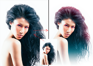
After your skin is good enough you can start having fun and caring about shine, volume, altering the makeup and so on. In this picture I did very little, there are two extra dodge and burn curve layers, and I used them a tiny bit in the hair, eyes, eyebrows and shoulders. I also used a hue/saturation adjustment to bump a little the makeup around the eyes.
The crazy coloring is done with two layers set to screen, filled with a gradient (linear one for the blue, and a round one for the red, then with some wide brushing and wide gaussian blur). Then the gray ramp was moved to something more interesting using separate r/g/b curves in the curve adjustment and some hue and saturation.
I have an action I recorded for printing/exporting, so if I have to share this I flatten layers, apply a curve that moves blacks to around 5 and whites to around 250, then do a detail unsharp mask a tiny bit of a wider unsharp mask, convert everything to sRGB and 8bits.



1 comment:
Interesting writeup, thanks.
--
Giuliano
Post a Comment