Search this blog

28 March, 2015

Being more wrong: Parallax corrected environment maps

Introduction

A follow-up to my article on how wrong we do environment map lighting, or how to get researchers excited and engineers depressed. 
Here I'll have a look at the errors we incur when we want to adopt "parallax corrected" (a.k.a. "localized" or "proxy geometry") pre-filtered cube-map probes, a technique so very popular nowadays.

I won't explain the base technique here, for that please refer to the following articles:

Errors, errors everywhere...

All these are in -addition- to the errors we commit when using the standard cubemap-based specular lighting.


1) Pre-filter shape

Let's imagine we're in an empty rectangular room, with diffuse walls. In this case the cubemap can be made to accurately represent radiance from the room.
We want to prefilter the cubemap to be able to query irradiance in a fast way. What shape does the filter kernel have?
  • The cubemap is not at infinite distance anymore -> the filter doesn't depend only on angles!
  • We have to look at how the BRDF lobe "hits" the walls, and that depends on many dimensions (view vector, normal, surface position, surface parameters)
  • Even in the easy case where we assume the BRDF lobe to be circularly symmetric around the reflection, and we consider the reflection to hit a wall perpendicularly, the footprint won't be exactly identical to one computed only on angles.
  • More worryingly, that case won't actually happen often, the BRDF will often hit a wall, or many walls, at an angle, creating an anisotropic footprint!
  • Pre-filtering "from the center", using angles, will skew the filter size near the cube vertices, but unlike infinite cubemaps, this is not exactly justified in this case, it optimizes for a single given point of view (query position)
  • Moreover! This is not radiance emitted from some magic infinitely distant environment. If we consider geometry, even through a proxy, we should then consider how that geometry emits radiance. Which is a 2D function (spherical). So we should bake a 4D representation, e.g. a cube map of spherical harmonic coefficients...
The pre-filter kernel for parallax-corrected cubes should be seen more as -a- kernel we applied and know...
It doesn't have a direct, one-to-one relationship with the material roughness... We can try, knowing we have a prefiltered cube, to approximate what fetch or fetches best approximate the actual BRDF footprint on the proxy geometry.

This problem can be seen also from a different point of view:
  • Let's assume we have a perfectly prefiltered cube for a given surface location in space (query point or "point of view"). 
  • Let's compute a new cubemap for a different point in space, by re-projecting the information in the first cubemap to the new point of view via the proxy geometry (or even the actual geometry for what matters...).
  • Let's imagine the filter kernel we applied at a given cubemap location in the original pre-filter. 

How will it become distorted after the projection we do to obtain the new cubemap? This is the distortion that we need to compensate somehow...

This issue is quite apparent with rougher objects near the proxy geometry, it results in a reflection that looks sharper, less rough than it should be, usually as we underfilter compared to the actual footprint.
A common "solution" is to not use parallax projection as the surfaces get rougher, which creates lighting errors.

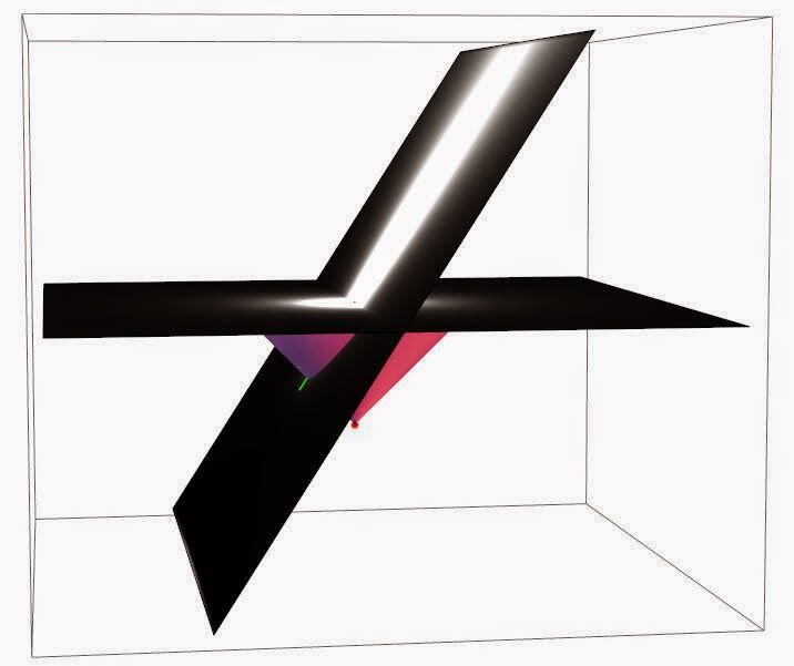
I made this BRDF/plane intersection visualization
while working on area lights, the problem with cubemaps is identical

2) Visibility

In most real-world applications, the geometry we use for the parallax-correction (commonly a box) is doesn't match exactly the real world geometry. Environment with all perfectly rectangular, perfectly empty rooms might be a bit boring. 
As soon as we place an object on the ground, its geometry won't be captured by the reflection proxy, and we will be effectively raytracing the reflection past it, thus creating a light leak.

This is really quite a hard problem, light leaks are one of the big issues in rendering, they are immediately noticeable and they "disconnect" objects. Specular reflections in PBR tend to be quite intense, and so it's not easy even to just occlude them away with standard methods like SSAO (and of course considering only occlusion would be per se an error, we are just subtracting light).

An obvious solution to this issue is to just enrich somehow the geometrical representation we have for parallax correction, and this could be done in quite a lot of ways, from having richer analytic geometry to trace against, to using signed distance fields and so on.
All these ideas are neat, and will produce absolutely horrible results. Why? Because of the first problem we analyzed! 
The more complex and non-smooth your proxy geometry is, the more problems you'll have pre-filtering it. In general if your proxy is non-convex your BRDF can splat across different surfaces at different distances and will horribly break pre-filtering, resulting in sharp discontinuities on rough materials.
Any solution to this that wants to use non-convex proxies, needs to have a notion of prefiltered visibility, not just irradiance, and the ability of doing multiple fetches (blending them based on the prefiltered visibility)

A common trick to partially solve this issue is to "renormalize" the cube irradiance based on the ratio between the diffuse irradiance at the cube center and the diffuse irradiance at the surface (commonly known via lightmaps). 
The idea is that such ratio would express somewhat well how different (due to occlusions/other reflections) how intense the cubemap would be if it was baked from the surface point.
This trick works for rough materials, as the cubemap irradiance gets more "similar" to diffuse irradiance, but it breaks for sharp reflections... Somewhat ironically here the parallax cubemap is "best" with rough reflections, but we saw the opposite is true when it comes to filter footprint...

McGuire's Screen Space Raytracing

3) Other errors

For completeness, I'll mention here some other relatively "minor" errors:
  • Interpolation between reflection probes. We can't have a single probe for the entire environment, likely we'll have many that cover everything. Commonly these are made to overlap a bit and we interpolate while transitioning from one to another. This interpolation is wrong, note that if the two probes reprojected identically at a border between them, we wouldn't need to interpolate to being with...
  • These reflection proxies capture only radiance scattered only at a specific direction for each texel. If the scattering is not purely diffuse, you'll have another source of error.
  • Baking the scattering itself can be complicated, without a path tracer you risk to "miss" some light due to multiple scattering.
  • If you have fog (atmospheric scattering), its influence has to be considered, and it can't really be just pre-baked in the probes correctly (it depends on how much fog the reflection rays traverses, and it's not just attenuation, it will scatter the reflection rays altering the way they hit the proxy)
  • Question: what is the best point inside the proxy geometry volume from which to bake the cubemap probe? This is usually hand authored and artists tend to place it as possible away from any object (this could be a heuristic indeed, easy to implement).
  • Another way of seeing parallax-corrected probes is to treat think of them really as textured area lights

A common solution to mitigate many issues is to use screen space reflections (especially if you have the performance to do so, fading to baked cubemap proxies only where the SSR doesn't have data to work.
I won't delve into the errors and issues of SSR here, it would be off-topic, but beware of having the two methods represent the same radiance. Even when that's done correctly, the transition between the two techniques can be very noticeable and distracting, it might be better to use one or the other based on location.

From GPU-Based Importance Sampling.

Conclusions

If you think you are not committing large errors in your PBR pipeline, you didn't look hard enough. You should be aware of many issues, most of them having a real, practical impact and you should assume many more errors exist that you haven't discovered yet.
Do your own tests, compare with real-world, be aware, critical, use "ground truth" simulations.

Remember that in practice artists are good at hiding problems and working around them, often asking to have non-physical adjustment knobs they will use to tuning down/skew certain effects.
Listen to these requests as they probably "hide" a deep problem with your math and assumptions.

Finally, some tips on how to try solve these issues:
  • PBR is not free from hacks (not even offline...), there are many things we can't derive analytically. 
  • The main point of PBR is that now we can reason about physics to do "well motivated" hacks. 
  • That requires having references and ground truth to compare and tune.
    • A good idea for this problem is to write an importance sampled shader that does glossy reflections via many taps (doing the filtering part in realtime, per shaded point, instead of pre-filtering).
    • A full raytraced ground truth is also handy, and you don't need to recreate all the features of your runtime engine...
  • Experimentation requires fast iteration and a fast and accurate way to evaluate the error against ground truth.
  • If you have a way of programmatically computing the error from the realtime solution to the ground truth, you can figure out models with free parameters that can be then numerically optimized (fit) to minimize the error...

21 March, 2015

Look closely

The BRDF models surface roughness at a frequency bigger than wavelength, but smaller than observation scale. 

In practice surfaces have details at many different scales, and we know that the BRDF has to change depending on the observation scale, that is for us the pixel projected footprint onto the surface.

Specular antialiasing of normal maps (from Toksvig onwards) which is very popular nowadays models exactly the fact that at a given scale the surface roughness, in this case represented by normal maps, has to be incorporated into the BRDF. The pixel footprint is automatically considered by mipmapping.

Consider now what happens if we look at a specific frequency of surface detail. If we look at it close enough, on an interval of a fraction of the frequency wavelength, the detail it will “disappear” and the surface will look smooth, determined only by the underlying material BRDF and an average normal over such interval.


If we “zoom out” a bit though, at scales circa proportional to the detail wavelength, the surface starts gets complicated. We can’t anymore represent it over such intervals as a single normal, nor it’s easy to capture such detail in a simple BRDF, we’ll need multiple lobes or more complicated expressions.

Zoom out even more and now your observation interval covers many wavelengths, and the surface properties look like they are representable again in a statistical fashion. If you’re lucky it might be in a way that is possible to capture by the same analytic BRDF of the underlying material, with a new choice of parameters. If you are less lucky, it might require a more powerful BRDF model, but still we can reasonably expect to be able to represent the surface in a simple, analytic, statistical fashion. This reasoning by the way, also applies to normalmap specular antialiasing as well...

The question is now, in practice how do surfaces look like? At what scales do they have detail? Are there scales that we don’t consider, that is, that are not something we represent in geometry and normal maps, but that are not either representable with the simple BRDF models we do use?

- Surfaces sparkle!

In games nowadays, we easily look at pixel footprints of a square millimetre or so, for example that is roughly the footprint on a character’s face when seen in a foreground full body shot, in full HD resolution.

If you look around many real world surfaces, over an integration area of a square millimetre or so, a lot of materials “sparkle”, they have either multiple BRDF lobes or very “noisy” BRDF lobes.


If you look closely at most surfaces, they won’t have smooth, clear, smooth specular highlights. Noise is everywhere, often "by design" e.g. with most formica countertops, and sometimes "naturally" even in plants, soft plastics, leather and skin notably.


Some surfaces have stronger spikes in certain directions and definitely “sparkle” visibly, even at scales we render today. Road asphalt is an easy and common example.


There are surfaces that have roughness at a frequency that is high enough to be represented always by a simple BRDF, but many are not. Some hard plastics (if not textured), glass, glazed ceramic, paper, some smooth paints.

Note: Eyes can be deceptive in this kind of investigation, for example Apple’s aluminum on a macbook or iphone looks “sparkly” in real life, but its surface roughness is probably too small to matter at the scales we render. 
This opens another can or worm that I won’t discuss, of what to do with materials that people “know” should behave in a given way, but that don’t really at the resolutions we can currently render at...

My Macbook Pro Retina

- Surfaces are anisotropic!

Anisotropy is much more frequent than one might suspect, especially for metals. We tend to think that only “brushed” finishes are really anisotropic, but when you start looking around you notice that many metals shows anisotropy, due to the methods used to shape them. 
Similar artifacts are sometimes found also in plastics (especially soft or laminated) or paints.


On the left: matte wall paint and a detail of its texture
On the right: the metal cylinder looks isotropic, but close up reveals some structure
It's also interesting to notice how the anisotropy itself can't be really captured by a single parameter, skewing the BRDF in a tangent space, but that there are many different distributions of anisotropic roughnesses.

- Surfaces aren’t uniform!

At a higher scale, if you have to bet how any surface looks at the resolutions we author specular roughness maps, it will always somewhat be non-uniform pixel to pixel.

You can imagine how if it’s true that many surfaces have roughness at frequencies that would require complex, multi-lobe BRDFs to render at our current resolutions, how it is even more likely that our BRDFs won’t ever have the exact same behaviour pixel to pixel.


Another way of thinking of the effects of using simpler BRDFs driven by uniform parameters is that we are losing resolution. We are using a surface representation that is probably reasonable at some larger scale, per pixel at a scale at which it doesn’t apply. So it’s somewhat similar to doing to right thing with wrong, “oversized” pixel footprints. In other words, over-blurring.

- Surfaces aren’t flat!

Flat surfaces aren’t really flat. Or at least it’s rare, if you observe a reflection over smooth surfaces as it “travels” along them, not to notice subtle distortions.

Have you ever noticed the way large glass windows for example reflect? Or ceramic tiles?


This effect is at a much lower frequency of course of the ones described above, but it’s still interesting. Certain things that have to be flat in practice are, to the degree we care about in rendering (mirrors for example), but most others are not.

- Conclusions

My current interest in observing surfaces has been sparkled by the fact I’m testing (and have always been interested) hardware solutions for BRDF scanning, thus I needed a number of surface samples to play with, ideally uniform, isotropic, well-behaved. And I found it was really hard to find such materials!


How much does this matter, perceptually, and when? I’m not yet sure. As it's tricky to understand what needs more complex BRDFs and what can be reasonably modeled with rigorous authoring of materials.


Textures from The Order 1886
Specular highlights are always "broken" via gloss noise,
even on fairly smooth surfaces


Some links:

14 March, 2015

Design Optimization Landscape


  • How consciously do we navigate this?
    • Knowledge vs Prototyping
    • Width vs Depth of exploration
    • Speculation is "fast" to move but with uncertainty
    • Application focuses and finds new constraints, but it's expensive
  • Multidimensional and Multiobjective
  • Fuzzy/Noisy, Changing over time
  • We are all optimizers
    • We keep a model of the design landscape, updated by information (experiments, knowledge). Biased by our psychology
    • We try to "sample" promising areas to find a good solution
    • Similar to Bayesian Optimization (information directed sampling)
Bayesian Optimization. Used in black-box problems that
have a high sampling (evaluation) cost.

OT: The design space of fountain pens

Met Stephen Hill at GDC this year, he casually mentioned that I should write an article about pens. Well Stephen maybe I WILL.

I try to live a reasonable life, but there are two things I do posses in more quantities I should: writing and photographic equipment. I would say that I collect them, but I don't keep these as a collector would, I actually use them with little regard, so I'm more just a compulsive buyer, I guess. 

But with much wasted money comes experience, or something.

- Why fountain pens

Calligraphy, duh! Line variation and reasons. Seriously though, they are different, and really it's a matter of taste... The feeling is different, they require less pressure, the ink is different... But nowadays rollerballs and gel pens have so many tips and technologies it's hard to compare. 
Also, on a purely utilitarian scale, I believe nothing can win a simple 0.5mm mechanical pencil...

Me writing this article.
Pen is a Namiki Vanishing Point ExtraFine
Notebook is a Midori Spiral Ring

So for the most part it is a personal choice, a matter of taste. I like them, they are elegant weapons for a more civilized age, and you might too. 
Now, without further ado, let's delve into this guide on how to start spending way too much money on pens.

- Nibs

First and foremost a fountain pen is about its nib. There are two main axes of nib selection: shape and material.

For shape, most pen brands will make three sizes of round tips: fine, medium and broad. Fancier brands might expand to extra fine, extra (or ultra or double) broad and maybe even ultra extra fine (sometimes also called needlepoint or accounting nib).

The catch here is that for the most part, these names carry little meaning. Especially on the finer scale the differences can be huge, traditionally Japanese nibs are finer, but some Japanese brands don't follow the rule.

A needlepoint nib (disassembled for repair), hand ground (Franklin-Christoph)

Italic, slab, oblique, cursive nibs are all variations of non round nibs, they produce a finer line in certain directions and a bolder one in others. Italic and slab are cut straight, with the italic being sharper (more difference between writing directions), crisper and harder to use. The oblique nib is cut at an angle. All these come in different sizes, usually specified as millimeters of their wider angle. Very wide stub nibs are also called "music" and often have more than a single ink slit, to keep the ink flowing. Lastly, "zoom" nibs, much rarer, have different weights at different angles.

Selection of Lamy steel nibs

More exotic nibs can be trickier to use and usually require better pens to work well. Bolder nibs lay down more ink, and thus stress the pen's ability of keeping a good, constant flow. Finer nibs are easier to break or misalign, they are harder to make and to make so they write smoothly. Very sharp italic nibs somewhat inherit the worst traits of both.

Consider also that broader nibs will use more ink (deplete faster), the ink will require more time to dry and can bleed more, but many people do like them better for fine writing as the properties of the ink (shading variation, sheen, color) show more with a wetter and more varied line.

Ink shading from an Italic nib
Image source: https://wonderpens.wordpress.com/tag/rhodia/

In terms of materials, there are really only two options: steel and gold. Both can then be plated in different materials (rhodium, ruthenium, pink gold, two-tone and so on) but that is only an aesthetic matter.

The functional difference between steel and gold is that the latter is softer, more flexible, thus it writes more smoothly and with more line variation. Steel is more durable and better for heavy handed writers.
Somewhat confusingly, both materials can be used to make flex and semi-flex nibs, which are thinner and specifically made to give lots of line variation. They are quite hard to use and suited mostly for calligraphy.

A Piltot/Namiki Falcon flex pen
Image source: https://www.youtube.com/watch?v=XMolEvB5EqA

Most pens have interchangeable nibs, and buying nibs alone is usually much cheaper than buying a full pen.

- Pen body

A big part in the choice of a pen is taken by its aesthetic, which is I guess entirely a matter of taste so I won't discuss it.

There are though a few functional considerations to keep in mind. Ergonomy of course is a big one. Bigger pens tend to be more comfortable but of course, less easy to carry around. Heavier pens might not be great for longer writing sessions, and balance can make a lot of difference.
For the most part, you'll have to try and see what fits you best. Remember to try any given pen with and without the cap posted, the balance will change significantly, with some pens designed to be posted while some others don't post very well.

The Franklin-Christoph 40 pocket need to be used with its cap posted,
it's way to short otherwise. Screw-on cap, clipless, can be converted to eyedropper

The filling mechanism and ink reservoir is also important. Most pens nowadays use plastic cartridges, most being "international standard". 
The second most widespread mechanism is the piston filler, which is quite convenient and usually has chambers that can carry more ink than a cartridge, but it won't allow you to carry spare ink as easily.

Now, you really will want to use bottled ink in your fountain pens, both because it's cheaper and it comes in a much wider selection, but having a cartridge pen won't stop you. Most of them can be fitted with "converters", special cartridges with a piston to suck ink from a bottle, and you can always refill a cartridge with a syringe (which I actually find less messy than dipping the nib in the bottle to refill).
Also, many (but not all) will work well as "eyedroppers", filling the cartridge chamber directly with ink (without a cartridge installed) and sealing it (a bit of with silicone grease on the screw)

There are other minor things to notice. As most pens are round, having a cap with a clip allows them not to roll, which might be something to consider even if you don't need to clip your pen to a notebook.

Nakaya "dorsal fin" model, an asymmetric design made to not roll even w/o a clip
Image source: http://www.leighreyes.com/?p=4313

The cap design and closing mechanism also matter, actually more than it might seem. Not only certain caps fit better posted than others, but certain designs are more prone to sucking some ink out every time you uncap. Screw on caps are less prone to this, but certain screws can be annoying to feel on the barrel of the pen, depending on how you hold it.

- Ink

A big reason to use fountain pens is that they allow to play with different inks. It might be actually a much more reasonable idea to collect and play with inks, than it is with different fountain pens.

Inks have lots of different attributes, even colors are not so simple as many inks can "shade", show variation (even drastic) as the pen lays down more or less ink on the page (according to pressure and speed), they can have sheen and even pigment or other particles embedded (these though are often more dangerous to use and can clog a pen if not properly handled)

Inks can be even more interesting than pens!
The Pen Addict is a good review site

They can be more or less lubricated, certain inks can flow well even in lesser pens while certain others tend to be more dry. If your pen is already on the dry side, you don't want to couple it with a dry ink, and vice-versa. Large nibs tend to need more flow (as they lay down a bolder line) but it's not rare to need wetter inks in extra-fine nibs as well, as the tines there need to be so small that non-well lubricated inks can have problems flowing.

Different inks also have different drying times, and tendency to feather or bleed through paper. Good paper will also help absorb less, but that also means it can increase dry times. Low feathering is important especially when using lesser papers or in finer nibs (that won't look as fine with an ink that expands a lot on the paper).

In practice though the first and most important characteristic to consider for daily use and note taking is water resistance. Most inks are not, and even a drop of water cleaned up quickly will ruin your notes. So before looking at color and other characteristics you have to be conscious about water resistance and decide if you need it or not. 
Dry times (smudging...) for me haven't been a problem on the other hand, but if you are left handed that can actually be very important (and I'll try to use a more porous paper that absorbs ink fast).

It's not in general "safe" to mix different inks, albeit most of the time it won't cause havoc and you can easily clean your pen by just running it under cold water until it flushes clean. There are certain brands who make mixable inks, but it's rare.

- Some recommendations

I will make a sweeping statement and say that there is no better "starter" fountain pen than a Lamy Safari (or Vista, a so called "demonstrator" - transparent version). Its aesthetic might not please everybody, but it's by far the best "writer" for the price, and it comes in a ridiculously wide selection of interchangeable nibs (they even make some optimized for left-handed writing).

A fairly recent contender to this throne is the TWSBI 850 and Mini, really great pens made to be fully disassembled easily. The Mini is probably the best compact pen you can buy today, it's a piston filler so it still holds quite a lot of ink too!

If you look for a great very extra-fine nib pen, I haven't so far found anything that beats the Pilot/Namiki Vanishing Point 18k gold nib (a.k.a. Capless Decimo). Right now it's my favorite pen, it's not very cheap, that's the only reason I didn't recommend it as starter. It's also pretty and unique. Some don't love its clip, with some effort it could be removed.

A&G Spalding and Bros make surprisingly good, cheap pens (considering the brand doesn't have a big history). Kaweco is cheaper brand recently gaining traction, but I don't like so far their nibs flow, especially on small pens you want -very- easy writing nibs, as these are to begin with not the most comfortable pens and applying pressure is fatiguing on them.

On the more expensive side, I would say to stay away from Montblanc and the other luxury brands, they are good pens but you pay because they are fancy more than because they are great. If you have lots of money or you want to make a really great gift, I'd personally go with a Nakaya, handmade and customized to your taste...

Medium-tier brands that I love, other than the already mentioned Namiki/Pilot (which also makes super expensive maki-e models, by the way) are Sailor and Platinum, both of them make great nibs (and true "Japanese" extra-fine ones) but somewhat more boring conventional "cigar" shaped pens. 
Franklin-Christoph is American brand which makes really unique, hand turned and not very expensive pens, worth a look.

There are of course many, many other great brands, certain fancy brands do make more "understated" models in their line which might turn out to be great, and vintage, used pens are also incredibly interesting, but all these I'd say would be less easy to recommend as a "first" pen.

After you get a pen you'll need paper and ink. Rhodia makes some great, inexpensive paper, but there are really many great brands. Field notes is really nice as well if you like small notebooks. Tomoe River paper is quite unique as well, but more a "fine writing" paper, not for daily use (will take time to dry especially for broader nibs).

I personally prefer spiral bound, A5 notebooks because they are easier to use on the go, they open fully and are more rigid, can be held one handed.
And if you are like me you don't love to have ruled or gridded paper, Rhodia and many other brands make notebooks in plain sheets or with less conspicuous dots instead of lines.

Lastly, inks. For Black I'll go with Aurora or the Platinum Carbon Black Ink, both are very black with great flow. The latter is pigmented which is very rare (another pigment ink is Sailor's Kiwa-Guro, that I haven't tried yet) it's nicer but it can settle in your pen if not used often and should be cleaned after depleting to avoid clogging, better use it in a cheaper pen you have no problems taking the nib apart for cleaning (which is usually fairly easy...).

For colored ink it's much, much harder, there are so many great options. I don't love plain blue ink and I usually go with either darker or lighter shades, one of my current favorites is the Private Reserve Naples Blue.

Sometimes I carry a red or more colourful ink, often in a broader nib for highlighting and so on. I find that orange/brown colors pair better with both black and blue than most reds. Noodler's Apache Sunset.

Lastly, if you want something super fancy, nothing is fancier than Herbin's Stormy Grey and Rouge Hematite limited edition inks (if you can still find them).

Incidentally, J.Herbin, Private Reserve and Noodler's together with Diamine are also the brands that make the most variety when it comes to colored inks.

Amazing (but not the smoothest ink ever).
Image source: http://www.gourmetpens.com/2014/11/review-j-herbin-stormy-grey-ink.html#.VQTK7VPF-xN