If you're a programmer and you don't have visualization as one of your main tools in your belt, then good news, you just found how to easily improve your skill set. Really it should be taught in any programming course.
Note: This post won't get you from zero to visualization expert, but hopefully it can pique your curiosity and will provide plenty of references for further study.
Note: This post won't get you from zero to visualization expert, but hopefully it can pique your curiosity and will provide plenty of references for further study.
Visualizing data has two main advantages compared to looking at the same data in a tabular form.
The first is that we can pack more data in a graph that we can get by looking at numbers on screen, even more if we make our visualizations interactive, allowing explorations inside a data set. Our visual bandwidth is massive!
This is useful also because it means we can avoid (or rely less on) summarization techniques (statistics) that are always by their nature "lossy" and can easily hide important details (the Anscombe's quartet is the usual example).
 |
| Anscombe's quartet, from wikipedia. Data has the same statistics, but clearly different when visualized |
The second advantage, which is even more important, is that we can reason about the data much better in a visual form.
0.2, 0.74, 0.99, 0.87, 0.42, -0.2, -0.74, -0.99, -0.87, -0.42, 0.2
What's that? How long do you have to think to recognize a sine in numbers? You might start reasoning about the simmetries, 0.2, -0.2, 0.74, -0.74, then the slope and so on, if you're very bright. But how long do you think it would take to recognize the sine plotting that data on a graph?
It's a difference of orders of magnitude. Like in a B-movie scifi, you've been using only 10% of your brain (not really), imagine if we could access 100%, interesting things begin to happen.
I think most of us do know that visualization is powerful, because we can appreciate it when we work with it, for example in a live profiler.
Yet I've rarely seen people dumping data from programs into graphing software and I've rarely seen programmers that actually know the science of data visualization.
Visualizing program behaviour is even more important in the context of rendering engineers or any code that doesn't just either fail hard or work right.
We can easily implement algorithms that are wrong but doesn't produce a completely broken output. It might be just slower (i.e. to converge) than it needs to be, or more noisy, or just not quite "right" and cause our artists to try to adjust for our mistakes by authoring fixes in the art (this happens -all- the time) and so on.
And there are even situations where the output is completely broken, but it's just not obvious from looking at a tabular output, a great example for this would be in the structure of LCG random numbers.
 |
| This random number generator doesn't look good, but you won't tell from a table of its numbers... |
- Good visualizations
The main objective of visualization is to be meaningful. That means choosing the right data to study a problem, and displaying it in the right projection (graph, scale, axes...).
The right data is the one that is interesting, it shows the features of our problem. What questions are we answering (purpose)? What data we need to display?
The right projection is the one that shows such features in an unbiased, perceptually linear way, and that makes different dimensions comparable and possibly orthogonal. How do we reveal the knowledge that data is hiding? Is it x or 1/x? Log(x)? Should we study the ratio between quantities or absolute difference and so on.
Information about both data and scale comes at first from domain expertise. A light (or sound) intensity probably should go on a logarithmic scale, maybe a dot product should be displayed as the angle between its vectors, many quantities have a physical interpretation and a perceptual interpretation or a geometrical one and so on.
But even more interestingly, information about data can come from the data itself, by exploration. In an interactive environment it's easy to just dump a lot of data to observe, notice certain patterns and refine the graphs and data acquisition to "zoom in" particular aspects. Interactivity is the key (as -always- in programming).
- Tools of the trade
When you delve a bit into visualization you'll find that there are two fairly distinct camps.
One is visualization of categorical data, often discrete, with the main goal of finding clusters and relationships.
This is quite popular today because it can drive business analytics, operate on big data and in general make money (or pretty websites). Scatterplot matrices, parallel coordinate plots (very popular), Glyph plots (star plots) are some of the main tools.
 |
| Scatterplot, nifty to understand what dimensions are interesting in a many-dimensional dataset |
The other camp is about visualization of continuos data, often in the context of scientific visualization, where we are interested in representing our quantities without distortion, in a way that the are perceptually linear.
This usually employs mostly position as a visual cue, thus 2d or 3d line/surface or point plots.
These become harder with the increase of dimensionality of our data as it's hard to go beyond three dimensions. Color intensity and "widgets" could be used to add a couple more dimensions to points in a 3d space but it's often easier to add dimensions by interactivity (i.e. slicing through the dataset by intersecting or projecting on a plane) instead.
 |
| CAVE, soon to be replaced by oculus rift |
Both kinds of visualizations have applications to programming. For deterministic processes, like the output or evolution in time of algorithms and functions, we want to monitor some data and represent it in an objective, undistorted manner. We know what the data means and how it should work, and we want to check that everything goes according to what we think it should.
But there are also times were we don't care about exact values but we seek for insight into processes of which we don't have exact mental models. This applies to all non-deterministic issues, networking, threading and so on, but also to many things that are deterministic in nature but have a complex behaviour, like memory hierarchy accesses and cache misses.
- Learn about perception caveats
Whatever your visualization is though, the first thing to be aware of is visual perception: not all visual cues are useful for quantitative analysis.
Perceptual biases are a big problem, because as they are perceptual, we tend not to see them, just subconsciously we are drawn to some data points more than others when we should not.
Beware of color, one of the most abused, misunderstood tool for quantitative data. Color (hue) is extremely hard to get right, it's very subjective and it doesn't express well quantities nor relationships (what color is less than another), yet it's used everywhere.
 |
| Metacritic homepage has horrid bar graphs. As numbers are bright and below a variable-size image, games with longer images seem to have lower scores... |
Beware of color, one of the most abused, misunderstood tool for quantitative data. Color (hue) is extremely hard to get right, it's very subjective and it doesn't express well quantities nor relationships (what color is less than another), yet it's used everywhere.
Intensity and saturation are not great either, again very commonly used but often inferior to other hints like point size or stroke width.
 |
| From complexdiagrams |
- Visualization of programs
Programs are these incredibly complicated projects we manage to carry forward, but if that's not challenging enough we really love working with them in the most complicated ways possible.
So of course visualization is really limited. The only "mainstream" usage you will have probably encountered is in the form of bad graphs of data from static analysis. Dependences, modules, relationships and so on.
 |
| A dependency matrix in NDepend |
Certainly if you have to see your program execution itself it -has- to be text. Watch windows, memory views with hex dumps and so on. Visual Studio, which is probably the best debugger IDE we have, is not visual at all nor allows for easy development of visualizations (it's even hard to grab data from memory in it).
We're programmers so it's not a huge deal to dump data to a file or peek memory [... my article], then we can visualize the output of our code with tools that are made for data.
But an even more important tool is to use visualization directly of the behaviour of code, in runtime. This is really a form of tracing which most often is limited to what's known as "printf" debugging.
Tracing is immensely powerful as it tells us at a high level what our code is doing, as opposed to the detailed inspection of how the code is running that we can get from stepping in a debugger.
Unfortunately there is today basically no tool for graphical representation of program state in time, so you'll have to roll your own. Working on your own sourcecode it's easy enough to put some instrumentation to export data to a live graph and in my own experiments I don't use any library for this, just write the simplest possible ad-hoc code to suck the data out.
Ideally though it would be lovely to be able to instrument compiled code, it's definitely possible but much more of an hassle without the support of a debugger. Another alternative that sometimes I adopt is to just have an external application peek at regular interval into my target's process memory.
It's simple enough but it captures data at a very low frequency so it's not always applicable, I use it most of the times not on programs running in realtime but as an live memory visualization while stepping through in a debugger.
Apple's recent Swift language seems a step into the right direction, and looks like it pulled some ideas from Bret Victor and Light Table.
Microsoft had a timid plugin for VisualStudio that did some very basic plotting that doesn't seem to be actively updated and another one for in-memory images, but what would be really needed is the ability to export data easily and in realtime as good visualizations are usually to be made ad-hoc for a specific problem.
 |
| Cybertune/Tsunami |
If you want to delve deeper into program visualization there is a fair bit written about it by the academia, with also a few interesting conferences, but what's even more interesting to me is seeing it applied to one of the hardest coding problems: reverse engineering.
It should perhaps not be surprising as reversers and hackers are very smart people, so it should be natural for them to use the best tools in their job.
It should perhaps not be surprising as reversers and hackers are very smart people, so it should be natural for them to use the best tools in their job.
It's quite amazing seeing how much one can understand with very little other information by just looking at visual fingerprints, data entropy and code execution patterns.
And again visualization is a process of exploration, it can highlight some patterns and anomalies to then delve in further with more visualizations or by using other tools.
And again visualization is a process of exploration, it can highlight some patterns and anomalies to then delve in further with more visualizations or by using other tools.
 |
| Data entropy of an executable, graphed in hilbert order, shows signing keys locations. |
- Bonus links
Visualization is a huge topic and it would be silly to try to teach everything it's needed in a post, but I wanted to give some pointers hoping to get some programmers interested. If you are, here some more links for further study.
Note that most of what you'll find on the topic nowadays is either infovis and data-driven journalism (explaining phenomenons via understandable, pretty graphics) or big-data analytics.
These are very interesting and I have included a few good examples below, but they are not usually what we seek, as domain experts we don't need to focus on aesthetics and communication, but on unbiased, clear quantitative data visualization. Be mindful of the difference.
- Some of my other posts
- Mathematica 101
- Peeking memory (this is great coupled with reflection or a language to define dependencies between data structures)
- Trace debugging from shaders
- Point clouds and processing
- Essential software
- Processing
- Python/IPython (anaconda), matplotlib (seaborn)
- Mathematica (mathics is interesting too)
- d3.js could be nifty too, especially if you already have a web frontend for your application as it's increasingly popular to do
- Don't use Excel, you'll waste time as it's very cumbersome to manipulate data there and its graphs are actually quite bad
- Books
- Tufte's works, starting with The Visual Display of Quantitative Information
- Now you see it and the other works of Stephen Few
- Information visualization, perception for design
- Software visualization
- The functional art
- Beautiful visualization
- Semiology of graphics
- Information visualization
- Data visualization principles and practice
- Talks
- Information visualization for scientific discovery
- Designing Data Visualizations
- BinVis hacking, Cantor Dust presentation, Visualizing Elf Binaries
- Beauty of data visualization
- 10 Reasons why we visualize big data
- Memory hierarchy visualization
- Caltech symposium on datavis (introduction)
- One of many talks on the subject by Golan Levin (from the above mentioned symposium)
- Weather data art is quite amazing
- Other Articles and websites (be sure to check the links -inside- the post first)
- Brendan Gregg's work often use visualizations to investigate performance issues
- University of Maryland Visualization Course
- Coursera Data Science
- Visualizing algorithms
- Visual Complexity
- WTF Visualizations
- Visualizing
- Flowing Data
- Data visualization catalogue
- Harward data science
- Compressed sensing
- At one point you'll need dimensionality reduction:
- http://en.wikipedia.org/wiki/Nonlinear_dimensionality_reduction
- http://jamesxli.blogspot.ca/2013/11/on-multidimensional-sorting.html
- http://homepage.tudelft.nl/19j49/t-SNE.html
- http://hal.archives-ouvertes.fr/docs/00/82/05/37/PDF/distances.pdf
- http://fraka6.blogspot.ca/2013/11/visualizing-high-dimensional-data-pca.html
- http://research.ics.aalto.fi/mi/software/dredviz/
- Addendum: a random sampling of stuff I do for work
All made either in Mathematica or Processing and they are all interactive, realtime.
All made either in Mathematica or Processing and they are all interactive, realtime.
 |
| Shader code performance metrics and deltas across versions |
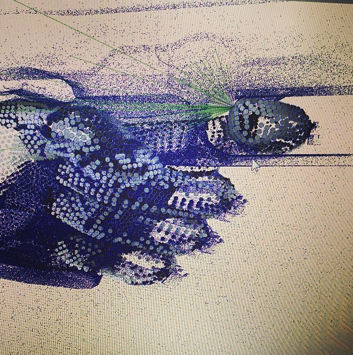 |
| Debugging an offline backer (raytracer) by exporting float data and visualizing as point clouds |
 |
| Approximation versus ground truth of BRDF normalization |
 |
| Approximation versus ground truth of area lights |
 |
| BRDF projection on planes (reasoning about environment lighting, card lighting) |
6 comments:
It seems that visualization is useful in other fields of computing as well: http://www.ted.com/talks/chris_domas_the_1s_and_0s_behind_cyber_warfare
This reminded me of a great little program back in the '80s, called something like The Visible 6502. I saw it on an Apple II but I think it may have also been available for Commodore 64. You could use it to execute any other program and it would display all of the 6502 registers and lines between system parts e.g. RAM and accumulator. It would show data moving around as a dot crawling along the lines drawn between the other components. Quite slow for actually executing code, but great for illustrating the concepts of machine code.
@hyc, a quick search told me that the program you're looking for is called "The Visible Computer: 6502" and a user's manual is available online as a PDF.
What I was really searching for, though, is this: http://visual6502.org/JSSim/index.html. It's not the same as The Visible Computer, but if you liked that, you might like this.
Cheers!
Dtrace and the work of people like Brendan Gregg has been pretty eye opening wrt to how advanced this kind of thing can be outside the Windows and Linux worlds.
Thanks Anon, adding links
I know a tool called VisualCue where in data sets are presented to customers to help in decision making.
Post a Comment